Fanart: Happy 1986
| Zetsubo [Zeichner-Galerie] | Upload: 31.12.2009 16:10 |
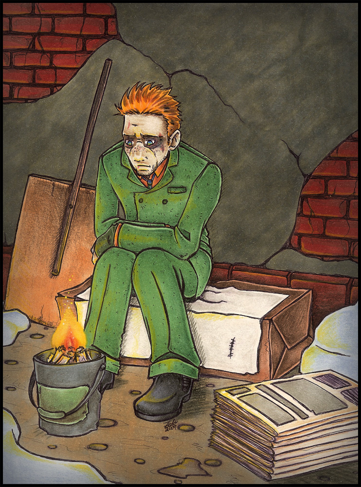
| Gezeichnet für den Watchmen Winter Contest @Gunga-Diner (DevArt) ...und weil ich nun zu faul bin um einen deutschen Kommentar zu schreiben... copy&paste~ === === === === === === === === === === === === === === === === === === Mrf. Terrible thumbnail makes it look terrible. Nrf. Oh well. Actually this one comes with a variety of titles... All of them giving this already fairly depressing image a different meaning alltogether. Original title was Christmas Eve - with a more general meaning. Though it somehow also tended to shift into Christmas Eve 1985. Take the hint. Though... Since Christmas is a week gone now... I simply moved the title forward. Tomorrow's the beginning of a new year after all! So I thought... Hell. Why not. Again: Take the hint. Mrrf. The motive itself... Is one I had in mind for a while... Though without the wintery part in mind. It's been just generally depressing back then. THough... In combination with the holidays mostly known to be the ones to be spend with family, friends, your beloved ones... Well... It kind of adds to the downpulling mood IMO. Actually... When working on the outlines with that thought in mind I had to stop for a couple of days 'cause I just couldn't bear looking at this anymore for it kind of... hrmn... Dunno. Too depressing. Kind of broke my heart to do this. ...but then again. No one'd truly believe Walter would ever be having some happy holidays, so... Yeah. [dot dot dot] ...should do a Chibi-version of this with Dan bringing him some coffee or something to cheer me up again... oô ~hrnf ... ... ... ...or any other more happy ideas around? Maybe something nice'n fluffy again? Yes? No? Hurn? ... Oh... Well. ... Have a nice day... And... Happy New Year to all of you. ~Zelu |
Themen: Watchmen - Die Wächter Stile: Alkoholmarker, Buntstifte Charaktere: Rorschach ...: Jupp. Frohes Neues Jahr auch an Animexx~ |
| Beschwerde |
Kommentare (4)
Du hast ja nur so wenig Kommentare. t___+
übel. Dabei kannst du echt gut zeichnen.
Die ganze Zeichnung ist zwar nicht mein Stil, aber du hast es drauf: Anatomie passt, linewightvaration ist überzeugend, die colo stimmt - wobei die Zeitung nen bissl zu ordentlich aussieht und eine konventionelle beschmierte Hauswand hätte auch sehr gut gepasst.
Was ich auch noch mal loben möchte: du arbeitest sehr sauber, das gefällt mir (mach ich auch - wenn die Bilder nicht zu groß werden)
Der HG ist ja auch klasse, mit den Zeitungen da im Vordergrund. :( Rorschach sieht wirklich sehr verlassen aus, ach, er ist einfach ANGST in Reinform <3
Sehr cool~!
Sehr cool~!
naja.... trotzdem:
1986 ist das beste Jahr von allen........ *husthust* > u >
Hier ist Colo cool.... weil Copics einfach ruhlen!! lD
bisous X3
1986 ist das beste Jahr von allen........ *husthust* > u >
Hier ist Colo cool.... weil Copics einfach ruhlen!! lD
bisous X3
Schaut sehr trostlos aus, wenn die Farben auch sehr warm gehalten sind.
wenigstens hat er ne Schneeschaufel um sich die Umgebung freizuschaufeln und ein bisschen trocken und warm :)
Schade, die serie kenn ich leider nicht
guten rutsch ins neue jahr ~
lg
de yommy
wenigstens hat er ne Schneeschaufel um sich die Umgebung freizuschaufeln und ein bisschen trocken und warm :)
Schade, die serie kenn ich leider nicht
guten rutsch ins neue jahr ~
lg
de yommy
